
Interior designers are seeing clients gravitate toward bolder, warmer, and more dynamic colors—ranging from sun-soaked terracotta and dusty emerald to periwinkle paired with chocolate brown.
Paint brands have already highlighted standout shades—Behr’s Hidden Gem (smoky jade), Valspar’s Warm Eucalyptus (muted green), and Benjamin Moore’s Silhouette (deep espresso with charcoal undertones). But designers reveal that homeowners are asking for even more adventurous palettes: walnut instead of white oak, merlot over greige, and color pairings that might seem unusual but create a striking, harmonious effect in practice.
Here’s what’s trending in 2026.
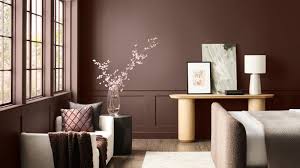
Warmer, Deeper Neutrals
Neutrals remain popular, but they are now warmer and richer. Stephanie Hunt, founder of The Flairhunter, notes, “Clients are moving away from ‘millennial grey’ and gravitating toward wood finishes and colors that feel inviting rather than cold or minimal.”
Emily Lindemann of Ruggles Lindemann Bell adds that browns, rusts, and greens are in high demand.
Jen Baxter of Baxter Hill Interiors predicts earthy, organic mid-tones like chalky rose, smoky blue, tobacco brown, dusty olive, sunbaked terracotta, and soft charcoal—colors that feel naturally worn and timeless. Matthias Silverton of The Snug Co. highlights rich, sun-soaked combinations such as olive green, mustard yellow, and burnt orange. Essentially, colors inspired by nature and sunlight are leading the way.
Dusty Jewel Tones
Jewel tones are returning, but with a muted, vintage feel. Hunt explains, “Think of an emerald ring rediscovered after decades in a jewelry box.”
Emily LaMarque of Emily LaMarque Design Studio sees clients drawn to deep, saturated colors: Prussian blue, deep sapphire, muted emeralds, earthy greens, and soft cranberry reds. Manuella Moreira adds that these hues add depth and sophistication, grounding rooms while layering in personality through complementary tones like amethyst.
Unexpected Color Combinations
The boldest trend of 2026 is unexpected, high-contrast color pairings. Sarah and Rebecca Goesling of Goesling Group say, “Colors are less about being classic and more about evoking emotion, mood, and memory.”
They highlight energetic shades—teal, cobalt, periwinkle, chartreuse—balanced with grounded, neutral colors. Favorite combinations include:
-
Satin periwinkle with velvet chocolate
-
High-gloss chartreuse with matte baby blue
-
Matte tangerine with metallic moss
Hunt also points out “color capping,” where a single color is used in multiple shades throughout a space—for example, the ceiling and upholstered headboard in one tone (light and dark variations) while chairs, bedding, and accessories complement with similar shades.
In 2026, interior color trends focus on warmth, richness, and creativity, blending earthy neutrals with jewel tones and bold contrasts for interiors that feel inviting, dynamic, and expressive.